A color accurate monitor is built to show colors the way the file defines them, so edits on screen match what you export or print. Makers usually list color space coverage such as sRGB, DCI-P3 or Adobe RGB, and many tune the panel before it ships.
The six monitors below range from a 24 inch 16:10 sRGB panel to a 32 inch 4K USB-C display and a 27 inch model that switches between 4K and 1080p modes. Sizes, resolution and gamut figures come from each product’s listing page and are the makers’ own. We have not used these monitors ourselves.
As an Amazon Associate we earn from qualifying purchases. Links below are affiliate links, and they do not change the product information we give.
What to Look For
| Feature | Why it matters |
|---|---|
| Color space coverage | sRGB suits web work; DCI-P3 and Adobe RGB suit wider video and print work |
| Resolution and size | 4K gives finer detail; 1440p or 16:10 can fit smaller desks |
| Panel finish | Matte or anti-glare surfaces cut reflections in bright rooms |
| Connections | USB-C with power delivery can run a laptop with one cable |
In this guide
Specs at a Glance
| Monitor | Size and resolution | Color | Notes |
|---|---|---|---|
| ASUS ProArt PA248QV | 24.1 in; 1920 x 1200, 16:10 | 100% sRGB and Rec.709 (maker) | 75 Hz; 300 cd/m2; flat finish |
| ASUS ProArt PA278QV | 27 in; 2560 x 1440 | 100% sRGB and Rec.709 (maker) | 75 Hz; 350 cd/m2; matte |
| ASUS ProArt PA279CRV | 27 in; 3840 x 2160 | 99% DCI-P3 and 99% Adobe RGB (maker) | USB-C with 96 W power delivery; matte; 60 Hz |
| ASUS ProArt PA329CRV | 31.5 in; 3840 x 2160 | 98% DCI-P3 (maker) | USB-C with 96 W power delivery; HDMI; DisplayPort |
| Samsung ViewFinity S7 (S71H) | 27 in; 3840 x 2160 | No gamut percentage on the page | 60 Hz; 300 cd/m2; matte; HDMI and DisplayPort |
| Acer ProDesigner PE270K L1 | 27 in; 3840 x 2160 | Factory color-tuned, Delta E under 1 in Adobe RGB mode (maker) | 4K at 72 Hz or 1080p at 144 Hz modes; anti-glare |
The 6 Best Color Accurate Monitors
Top pickBest for compact desks and web or photo work
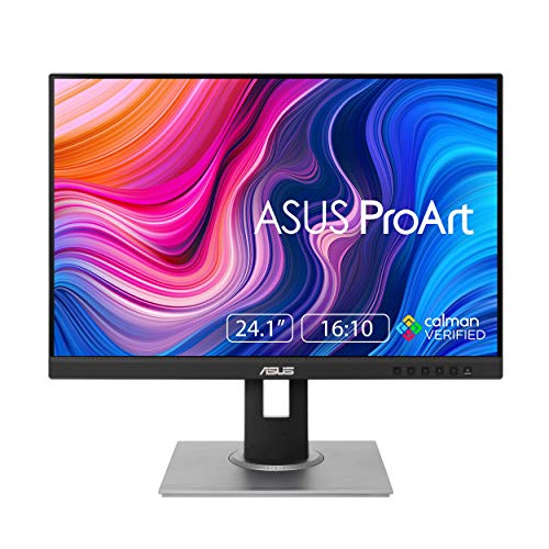
1. ASUS ProArt PA248QV 24 Inch
A 24.1 inch 16:10 monitor with a 1920 by 1200 resolution, an IPS panel, a 75 Hz refresh rate and 100 percent sRGB and Rec.709 coverage, as the maker states.
Suits: compact desks and web or photo work. Strengths: the extra height of 16:10 and a flat, simple panel. Weaknesses: modest resolution and 300 cd/m2 brightness. Skip it if you want a wider gamut or 4K.

View ASUS ProArt PA248QV 24 Inch WUXGA 16:10 Professional Monitor on Amazon

Best for a roomy 1440p workspace
2. ASUS ProArt PA278QV 27 Inch
A 27 inch 2560 by 1440 IPS monitor with a matte finish, 75 Hz refresh, 350 cd/m2 brightness and 100 percent sRGB and Rec.709 coverage, plus a USB hub and ProArt preset controls.
Suits: a roomy 1440p workspace. Strengths: a larger screen than the 24 inch model and presets for common tasks. Weaknesses: sRGB-class gamut only. Skip it if you grade wide-gamut video.

View ASUS ProArt PA278QV 27 Inch 1440p QHD Professional Monitor on Amazon

Best for photo and video work with a laptop
3. ASUS ProArt PA279CRV 27 Inch 4K
A 27 inch 4K IPS monitor with 99 percent DCI-P3 and 99 percent Adobe RGB coverage, factory color tuning to Delta E under 2, a matte surface and DisplayPort over USB-C with 96 watt power delivery.
Suits: photo and video work with a laptop. Strengths: wide gamut, USB-C charging and daisy-chain support. Weaknesses: 60 Hz refresh. Skip it if you want a high refresh rate. The page lists brightness as 400 cd/m2 while other fields differ, so confirm before buying.

View ASUS ProArt PA279CRV 27 Inch 4K UHD USB-C HDR Professional Monitor for Mac on Amazon

Best for large timelines and detailed retouching
4. ASUS ProArt PA329CRV 32 Inch 4K
A 31.5 inch 4K IPS monitor with 98 percent DCI-P3 coverage, factory color tuning to Delta E under 2, USB-C with 96 watt power delivery, DisplayPort, HDMI and a USB hub.
Suits: large timelines and detailed retouching. Strengths: the biggest screen here and a full set of ports. Weaknesses: 21.8 pounds and a big desk footprint. Skip it if space is tight. The page lists a glossy finish and a brightness figure in lumens, which conflict with the usual specs, so check before ordering.

View ASUS ProArt PA329CRV 32 Inch 4K DCI-P3 USB-C Professional Monitor for Mac on Amazon

Best for a simple 4K screen for general creative work
5. Samsung ViewFinity S7 (S71H) 27 Inch 4K
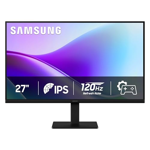
A 27 inch 4K IPS monitor with a matte finish, 300 cd/m2 brightness, 60 Hz refresh, HDMI and DisplayPort inputs and a Game Mode for color and contrast presets.
Suits: a simple 4K screen for general creative work. Strengths: 4K detail and a straightforward port set. Weaknesses: the page gives no gamut percentage or tuning data. Skip it if you need documented color coverage.

View Samsung 27″ ViewFinity S7 (S71H) 4K UHD IPS HDR10 High Resolution Monitor on Amazon
Best for people who edit and also check fast footage
6. Acer ProDesigner PE270K L1 27 Inch
A 27 inch IPS monitor that switches between 4K at 72 Hz for color work and 1080p at 144 Hz for fast motion, tuned at the factory to Delta E under 1 in Adobe RGB mode, as the maker states, with an anti-glare finish.
Suits: people who edit and also check fast footage. Strengths: two modes and a per-unit test report in the box. Weaknesses: 24.7 pounds. Skip it if you want a lighter display. The details table lists a 90 gamut value, so confirm coverage with the maker.
View Acer ProDesigner PE270K L1 27 Inch 4K Monitor on Amazon
Care and Setup
- Let the monitor warm up before judging color.
- Work in even room light, away from direct sun on the screen.
- Pick the color mode that matches your output, such as sRGB for web.
- Re-measure with a colorimeter now and then if color matters to your work.
Mistakes to Avoid
- Assuming every 4K monitor covers a wide gamut.
- Editing at full brightness in a dim room.
- Ignoring the port you need, such as USB-C for a laptop.
- Skipping the product page’s conflicting specs.
Matching Color Space to Where Your Work Ends Up
The most common buying mistake is paying for a gamut you will never deliver in. Color space should follow your final destination. If most of your photos and videos are viewed on websites, phones and social platforms, sRGB is the target, and a monitor that covers sRGB well is all you need. A wider panel can still be used for sRGB work, but only if it has a reliable sRGB mode that clamps colors; otherwise images look oversaturated on screen and flat everywhere else.
Wider spaces such as DCI-P3 matter when you deliver to cinema-style projection, modern HDR-capable phones and TVs, or video pipelines that grade in P3. Adobe RGB matters mostly for print, particularly saturated greens and cyans that an sRGB screen cannot show. Ask yourself three things: where will the file be viewed, what color space does your editing software export in, and does your print lab accept anything beyond sRGB? If the honest answers are web, sRGB and no, the cheaper sRGB-class screens in this guide are the logical match.
Remember that coverage percentages describe how much of a space the panel can reproduce, not how accurate it is out of the box. A monitor can cover a wide gamut and still show tints until it is tuned or profiled. Look for both pieces of information on the listing: the coverage figure and whether the unit was tuned at the factory. Where either is missing, treat it as unknown and check with the maker rather than assuming.
Calibration, Profiling and What Delta E Tells You
Delta E is a measure of the difference between a color the screen is told to show and the color it actually shows. Lower is better, and values around or under 2 are generally hard to tell apart by eye for most people. A listing that mentions factory tuning is describing a starting point measured on a sample of colors, not a promise that every color across the screen is perfect.
A hardware colorimeter or spectrophotometer lets you measure your own unit. The process usually has two parts: calibration, which adjusts the monitor’s own settings such as brightness and white point, and profiling, which records how the screen behaves so color-managed software can compensate. Some monitors let the software write adjustments into the display itself, which keeps the correction active with any application. Others rely on a computer-side profile, which only helps programs that read it. Check the manual or listing to see which approach your model supports.
Pick targets that suit the job. A common choice for general photo and web work is a moderate brightness, a daylight-style white point and a standard gamma. For print comparison, many editors choose a lower brightness so the screen matches a paper proof under normal room light. Run the measurement after the monitor has been on for a while, and repeat it on a schedule, since panels and backlights change slowly with use. If your income depends on color, a measuring device is a worthwhile companion to any of these screens.
Room Light, Glare and Viewing Position
Even a perfectly tuned panel misleads you in a bad room. Aim for steady, neutral lighting that does not change through the day. Windows that swing from warm morning light to cool afternoon light shift how your eyes judge white, so many editors work with curtains drawn or with a consistent lamp. Avoid bright colored walls near the screen, since they reflect into your field of view and tint perception.
Glare is the second problem. Matte and anti-glare finishes cut reflections from lamps and windows, which is why they are favored for editing; glossy finishes can look punchier but mirror anything behind you. If a listing is ambiguous about the finish, as some are, confirm it before ordering because it affects how usable the screen is in a bright space. A monitor hood, which is a simple shade around the top and sides, can help further and costs little, though you should check that it fits your screen size.
Position matters because IPS panels still shift slightly when viewed from an angle. Sit centered, with the top of the screen near eye level, and avoid judging color while leaning. Keep brightness at a comfortable level for the room rather than maximum; a screen far brighter than its surroundings makes shadows look darker and makes your edits come out too bright on other devices. Take short breaks and look away, because tired eyes judge color poorly.
Laptop Pairing, Ports and Cables
Connection choices decide how convenient a color monitor is day to day. A USB-C input that carries video and power can drive a compatible laptop and charge it through one cable, but only if the laptop’s USB-C port supports video output and the monitor’s power delivery wattage meets the laptop’s needs. A thin laptop may charge happily at the monitor’s rating, while a larger machine could charge slowly or not at all under load. Check the laptop maker’s specifications for the port’s capabilities.
Cables matter more than people expect. A cable that is not rated for the full resolution and refresh rate can cause flicker, dropouts or a lower mode than you paid for. Use the cable supplied in the box when one is included, and if you replace it, choose one rated for the video standard you are using. For a 4K signal at 60 Hz, make sure the cable, the computer’s port and the monitor input all support that mode.
Consider operating system settings as well. Set scaling so text is readable at the monitor’s native resolution, since high resolution on a modest screen can make interface elements tiny. Confirm that your computer is outputting the full color range and the intended bit depth, and that it is not stuck in a limited mode. On laptops with their own wide-gamut screens, remember that each display needs its own profile, and apps must be color managed to apply them correctly.
Budget Tiers and Signs It Is Time to Upgrade
Qualitatively, the entry tier gives you solid sRGB coverage, a sensible size and basic presets. It suits web work, social content and hobby photography, and it is a good place to learn color management. The middle tier adds higher resolution, more connectivity such as USB-C, and sometimes better tuning documentation. The top tier brings wide gamut coverage, per-unit tuning, bigger panels and richer ports, which is what professional video, print and retouching tend to justify.
Before spending more, ask what limits your work today. If your files look wrong on other devices, calibration and room conditions may fix more than a new panel. If you cannot see detail in a layered timeline, resolution or size is the limit. If prints never match the screen, the gamut and a measured profile are the place to look. Spend on the constraint you actually have.
Signs the monitor is aging include a visible color cast that calibration cannot remove, a screen that cannot reach its original brightness, uneven patches in the backlight, flicker, dead or stuck pixels in the active area, and a measuring device that reports it can no longer hit its targets. At that point, a replacement will likely improve your workflow more than another round of adjustments. When shopping, read the listing for conflicting figures, and ask the maker or seller to clarify before you commit.
A Glossary for Reading Color Specifications
Monitors for photo and video work throw many technical terms at the buyer. Understanding them lets you read a listing without being swayed by marketing language. Here are the words you will meet most often.
- Color gamut: the range of colors a display can show. Common gamuts include sRGB, Adobe RGB and DCI-P3.
- Coverage versus volume: coverage says how much of a gamut the monitor can reproduce. Volume compares the size of the whole color space.
- Delta E: a measure of color difference. Smaller values mean the displayed color is closer to the target.
- Bit depth: the number of levels per color channel. Eight-bit and ten-bit panels differ in how smooth gradients look.
- Calibration: adjusting a display to a known standard, usually with a measuring device called a colorimeter.
- Hardware calibration: adjusting color inside the monitor itself, instead of through computer software.
- Uniformity: how evenly brightness and color are spread across the screen.
- Panel type: IPS, OLED and other technologies behave differently in viewing angle and contrast.
- Brightness in nits: a measure of how bright the screen can get.
Look for factory calibration reports, which some makers include, but remember that no monitor stays perfect forever. Regular checks keep it close to the target.
Setting Up a Room for Trustworthy Color
A fine display can still mislead you if the room works against it. Light falling on the screen and the colors around it change how your eyes judge the image. These adjustments cost little and help.
| Room factor | Problem it causes | Fix |
|---|---|---|
| Window beside the screen | Changing light skews your perception through the day | Use curtains or position the monitor at right angles to the window |
| Bright wall colors | Reflections and color casts on the display | Neutral gray or muted walls help |
| Glossy screen | Reflections of lamps and bright clothing | Use a hood or shade, or choose a matte finish |
| Mixed bulbs | Different color temperatures in one room | Use bulbs of the same type, ideally neutral white |
| Very high brightness | Edits look too dark when printed | Set brightness to suit your room and workflow |
Warm up the monitor for about half an hour before critical work, since colors may shift slightly as the display reaches its normal temperature. Calibrate on a regular schedule with a colorimeter, following the instructions of the device and your software.
Use a color-managed workflow. Make sure your editing software uses a proper profile, and that your export settings match the destination, whether that is a screen, a print shop or a video platform.
Finally, view your work on other devices now and then. A phone, a laptop and a printed proof show how your image behaves outside the studio, and keep your expectations realistic.
Choosing a Colour Accurate Monitor in More Depth
Colour accuracy on a specification sheet is a starting promise; the accuracy you experience is built from the panel, the calibration, your room and your habits together. When comparing the picks in this guide, separate what the monitor provides, gamut coverage, uniformity, a factory report, from what you must provide: consistent lighting, sensible brightness and a calibration routine. Buyers who understand that split choose well and stay happy; buyers who expect the box alone to deliver truth often blame an excellent monitor for a difficult room.
Uniformity deserves more attention than it gets. A monitor can measure beautifully in the centre and drift toward the edges, which matters when you judge skies, studio backgrounds or product colours across the frame. Work with that reality: keep critical colour decisions toward the centre of the screen, be suspicious of edge-to-edge gradients that only exist on your display, and let calibration and a test image you know well teach you your specific panel’s personality. Every monitor has one; professionals learn theirs rather than pretending otherwise.
Size, Resolution and Working Distance
Choose size and resolution as a pair, judged from your actual chair. A larger screen at the same resolution spreads pixels wider, which some editors love for interface comfort and others find coarse for fine retouching; a smaller, denser screen packs detail but can shrink interface elements. There is no universal winner, only the combination that suits your eyes, your desk depth and your applications. If you work at a shallow desk, a moderate size keeps the whole frame in comfortable view without head-turning, which quietly improves composition judgement.
Panel height and ergonomics are colour issues in disguise. A screen you view from above or below at a steep angle shifts perceived contrast and colour, so a stand with real height and tilt adjustment, or a monitor arm, is part of the colour budget. Set the screen so your eyes meet its upper third naturally, at arm’s length or a little more, and your colour decisions will stabilise before you touch a single setting.
Calibration: The Habit That Makes It True
Calibrate on a rhythm, not on a whim: after the monitor has warmed up, in the lighting you actually work in, and repeat on a schedule as the panel ages. Keep brightness at a level that matches your room and your output; the commonest colour error in home studios is a screen far brighter than the prints it predicts, which makes prints look mysteriously dark until the day the brightness habit is fixed. Write your settings down, because a documented setup can be restored after any accidental change.
If you do not own a calibrator yet, the monitor’s well-reviewed factory modes and a consistent room still get you far for screen-delivered work. But the moment your images go to print, to clients with their own screens, or to anywhere money changes hands, a hardware calibrator stops being an accessory and becomes the cheapest insurance in the room. Borrow one for a first calibration if you must; the difference between assumed accuracy and measured accuracy is the whole subject of this guide.
Colour Monitors in Real Workflows
For photographers, the monitor is the darkroom: every decision about exposure, white balance and contrast is really a decision about what this screen shows you. Build a small ritual around critical work: same room lighting, same brightness, a neutral desktop background, and a known reference image opened first to confirm the screen looks like itself today. That two-minute ritual prevents the slow drift of judgement that makes a week’s edits inconsistent with each other.
For video work, colour accuracy partners with consistency across time: a shot graded on Monday must match the same shot revisited on Friday. Favour monitors and modes that hold their behaviour, keep your grading environment dim and stable, and use scopes alongside your eyes, because scopes do not get tired or adapt to the room. The picks in this guide serve both stills and motion; your environment decides how much of their accuracy you actually receive.
For designers and mixed-media workers, the monitor must serve two masters: colour-critical imagery and long hours of text and interface. Matte coatings, comfortable brightness ranges and flicker-conscious backlights matter across a working day as much as gamut does in a single judgement. If your day mixes both, weight comfort features honestly; a technically superb screen that gives you headaches by three in the afternoon is not the professional tool it claims to be.
Setup, Room and Troubleshooting
Your room is half the display system. Keep strong light sources off the screen, avoid a bright window behind you reflecting in the panel or a coloured wall beside it tinting your judgement, and favour neutral, dim surroundings for critical work. A desk lamp aimed at the wall rather than the screen, curtains for the worst hour of sun, and a grey rather than brightly coloured wall behind the monitor are cheap upgrades that make an expensive panel honest.
When colours look wrong, troubleshoot in order: confirm the application is colour-managing correctly, confirm the monitor is in the mode you calibrated, confirm the file’s colour space, and only then suspect the panel. Most wrong-colour mysteries are a mode changed by an update, a cable or input behaving differently, or a file arriving in an unexpected space. Change one link at a time, test with a file you know, and keep notes; colour chains reward the methodical.
Keep the panel clean with a soft, dry cloth and patience, and never spray cleaner directly onto the screen. Dust and fingerprints are contrast thieves, and a surprising number of my monitor looks dull stories end with a cloth. While you clean, check your viewing position and lighting again; maintenance of the environment belongs on the same schedule as maintenance of the glass.
How the Picks Differ in Practice
The ASUS ProArt entries in this guide form a ladder of size and resolution within one colour philosophy, letting you choose your working scale without changing your colour behaviour. The Samsung and Acer options bring their own takes on the same brief, panel character, stand design and connectivity varying in ways that matter to specific desks. Read the per-pick notes with your desk measurements and your main applications in mind; colour monitors are long-term residents, and fit compounds daily.
Decide finally by the work you deliver. Screen-only delivery forgives more; print and client delivery forgives little. The monitor that matches your delivery, your room and your calibration commitment is the accurate one in practice, whatever the laboratory says about its rivals.
Building a Colour Discipline That Survives Busy Weeks
Colour discipline fails not in the grand decisions but in the tired ones: the midnight edit under a bright lamp, the quick export from an uncalibrated mode because a deadline pressed. Build the discipline into defaults so that tired-you cannot easily betray it: the calibrated mode as the monitor’s home, the working brightness as the saved value, the reference image as the first file opened in any serious session. Systems that rely on remembering fail exactly when memory is busiest.
Keep a colour log alongside your project notes: calibration dates, the settings chosen, any change to room or lighting, and any delivery that came back with a surprise. Surprises are tuition only when they are recorded; unrecorded, they are just weather. Across a year, the log reveals the pattern of your own colour life, which deliveries are sensitive, which rooms betray you, which habits hold, and that pattern is worth more than any single calibration.
Teach your eyes with deliberate comparisons. Take one finished image and view it in your calibrated setup, on an ordinary screen, and in print, and study what survives translation and what does not. Repeat with each new kind of subject you take on. This translation literacy, knowing how your colours travel, is the professional skill that clients are actually buying when they pay for colour accuracy, and it cannot be downloaded or defaulted into existence.
When work is shared, agree the viewing conditions as part of the delivery: this file expects a colour-managed viewer, that proof expects the print under good light. Half of all colour disputes are two honest people looking at the same file in different worlds. Naming the world in advance prevents the dispute, and the monitor’s accuracy finally gets to do its work inside a conversation that deserves it.
The goal of all this discipline is freedom, not fussiness: a setup you trust so completely that you stop checking it and start seeing photographs again. Colour-critical monitors are bought to remove a category of doubt from a photographer’s life. The removal is completed not by the purchase but by the habits, and the habits, once built, are permanent capital.
Two-Monitor Desks and the Colour Monitor’s Place in Them
Many colour workers end with two screens: the calibrated monitor for the image, and a second, ordinary screen for email, panels, references and music. The arrangement protects the calibrated space from clutter and gives the image room to be judged whole. If you adopt it, keep the colour monitor directly in front of your working position and the utility screen to the side; the body should face the truth, with administration in the periphery where it belongs.
Match the two screens’ brightness loosely so your eyes are not re-adapting at every glance, but never judge colour on the utility screen, even in a hurry, even just to check. Habits of judgement are the real calibration. If the second screen tempts you, move the image, not your standards: drag the photograph to the calibrated panel and decide there, every time, until the discipline is reflex.
Cable and stand order matter more in a pair: the colour monitor gets the best connection path and the ergonomic position, and its settings are documented and defended against helpful resets. A two-screen desk multiplies small confusions, so the documentation habit from earlier in this guide doubles in value. The goal remains the same as with one screen, a judgement environment you can trust without thinking, now with room to work around it.
Judging Photographs of People: Skin Tone as the Daily Test
Of all the colours you will judge, skin tones are the daily examination, because viewers forgive a strange sky and never forgive a strange face. Keep reference portraits whose skin you know in life, open them in every calibration check, and learn how your monitor renders the range of tones your work actually contains. A setup that keeps faces honest across that range will keep almost everything else honest as a side effect.
When a portrait looks wrong, resist global corrections until you have checked the local truths: the light the skin was actually in, the colour of the wall it reflected, the mixed sources no monitor setting can untangle. Colour accuracy is a chain that begins at the scene, and the monitor’s job is to report the chain faithfully, not to redeem it. Knowing which link failed is the difference between an editor and a slider collector.
More Notes for Colour-Critical Work
Keep a folder of personal reference images: a portrait with skin tones you know, a grey studio background, a saturated product shot and a deep-shadow scene, all in final, trusted form. Open them after any change to screen, room or software. Your own references detect drift in the colours you actually work with, which generic test patterns cannot do for you.
Name your monitor modes and settings in a note taped inside a drawer: calibrated mode name, brightness value, and the date of the last calibration. Future you, after an update resets everything at midnight before a deadline, will restore the setup in two minutes and feel unreasonably grateful to past you.
Keep a small field notebook or a notes app entry for every outing: subject, light, settings that worked and settings that failed. Patterns appear quickly. The combination that nailed a sharp frame in flat morning light will not be the combination that works at dusk, and having your own record beats generic advice because it describes your hands, your support and your typical subjects. Review the notes monthly and turn repeats into defaults.
Clean gear on a schedule rather than on a panic basis. Dust and fingerprints accumulate gradually, so image quality slides gradually too, and it is easy to blame the equipment for what is really a dirty front element or a smudged screen. A blower, a soft brush and a microfibre cloth kept in the bag handle most of it. Anything beyond that, follow the maker guidance for your specific model.
Back up on the same day you shoot. Cards fail, bags get left in cars, and files that exist in exactly one place are files you are in the process of losing. A simple routine, card to computer to a second drive or cloud folder, takes minutes and protects hours of work. Format cards in the camera afterwards rather than deleting files one by one, which keeps the file system tidy.
Practise the boring fundamentals at home so they are automatic in the field: changing settings without looking, swapping cards and batteries by feel, and recovering from a missed shot without fussing. The moments worth capturing rarely wait while you scroll menus. Ten quiet minutes of drills each week does more for your hit rate than another accessory purchase.
Judge your results at the size you actually share or print. Pixel-level inspection has its place when you are diagnosing a problem, but most images live on screens and modest prints, where composition, timing and light matter far more than microscopic sharpness. Chasing perfection in the corners can talk you out of a tool that would serve you well for years.
Buy for the subjects you shoot most, not the subjects you imagine shooting once. A kit optimised for a rare trip and wrong for weekly use becomes shelf decoration. List your last stretch of real outings, count the subjects honestly, and let that tally steer the decision. The right tool is the one that disappears into the routine you already have.
Keep your expectations calibrated by the work, not the advertisements. Every camera system in this guide was designed around real compromises made by real engineers, and the photographers who thrive are the ones who learn their own system’s compromises so thoroughly that they stop experiencing them as limits. That fluency, knowing exactly what your gear will do before you press the shutter, is worth more than any single upgrade, and it is acquired free, one deliberate outing at a time.
Share your work and invite honest critique from people whose photographs you respect. Fresh eyes find the recurring habits, the horizon that always tilts, the background you never notice, that solitary review cannot. Critique stings briefly and teaches permanently. Pair it with studying photographs you admire and asking precisely what the photographer did, with position, timing and light, to earn the effect, and your own practice gains a curriculum.
Print something regularly, even small. A print is an honest editor: it reveals focus, colour and composition truths that a glowing screen forgives, and it turns photographs into objects your household actually lives with. The discipline of choosing what deserves paper sharpens every upstream decision, from which lens leaves the house to which frame survives the evening cull.
Revisit old photographs with new skills before buying new equipment. Archives are full of frames that were limited by the editor you were, not the camera you had, and reworking them is both free education and a useful audit of whether your limitations are truly technical. More than one photographer has cancelled an upgrade after discovering their old files were better than their old processing.
Budget honestly across the whole system, not just the headline item. The accessory, the bag, the spare battery, the support and the storage that a serious tool quietly requires are part of its true cost, and planning for them at purchase time prevents the resentment of a great tool starved by its supporting cast. A slightly humbler headline item with a complete system around it outperforms a flagship standing alone in almost every real photographer’s life.
Learn to leave a scene with the photograph rather than the regret. Work the subject while the light holds, vary position and framing deliberately, then check the essentials, focus, exposure, the edges of the frame, before you walk away. The check takes seconds in the field and is impossible to perform later. Departures are where good photographers are made, because they are where almost-good photographs get converted into good ones.
Keep your settings philosophy simple enough to explain to a stranger in one minute. Complexity that cannot be explained cannot be troubleshooted at speed, and speed matters when light and subjects are moving. A small set of understood defaults, varied deliberately, beats a thicket of saved modes whose contents you half remember. Simplicity is not the opposite of sophistication in photography; it is what sophistication looks like after experience has edited it.
Schedule an annual kit audit: what earned its place this year, what travelled and never left the bag, what failed and was forgiven too many times. Sell, gift or retire the honest failures and let the kit shrink toward the tools your photographs actually come from. A smaller, known kit is a creative advantage, and the audit is how photographers keep one across a lifetime of tempting new releases.
Color Accurate Monitor FAQ
Which color space should I choose?
sRGB suits web work. DCI-P3 and Adobe RGB cover more colors for video and print.
Does factory tuning last?
Factory color tuning is a starting point. Panels drift over time, so re-measure if exact color matters.
Do I need a colorimeter if the monitor is factory tuned?
Factory tuning is a useful starting point, but panels change over time and your room and settings differ from the factory's. If color decisions affect paid work or prints, a measuring device lets you verify and correct the screen yourself. For casual use, the factory tuning may be enough.
Is a wide-gamut monitor harmful for web work?
Not harmful, but it can mislead you if the screen displays sRGB content with stretched colors. Use a proper sRGB mode if the monitor offers one, and make sure your editing software is color managed. Without that, images may look more saturated than they will appear to viewers.
Does a higher refresh rate matter for color work?
Mostly no. Color accuracy, uniformity and resolution matter more for editing, while refresh rate helps with motion smoothness. A model that offers a fast mode as a secondary option can be handy if you also review quick footage.
How long should I let the monitor warm up before editing?
Many people allow the screen to run for a while so brightness and color settle, and the same applies before calibrating. Check the manual for any suggested warm-up time, and be consistent so your measurements are comparable.
What if the product page lists conflicting specs?
Treat the disputed figures as unconfirmed. Compare the listing with the maker's own page or manual, and contact the seller if needed. Do not rely on a figure that contradicts other fields on the same page.
Can I use a color monitor for gaming too?
Yes, though these screens are tuned for accuracy rather than speed. If you also play, look at the refresh rate and any extra modes, and expect that some models will favor color over motion performance.
Is a bigger screen always better for editing?
Not always. A larger panel gives more room for timelines and palettes, but it needs a deeper desk and a comfortable viewing distance. At that size, uniformity across the screen matters more, so a mid-size model can be the better fit for a small workspace.
Do I really need a hardware calibrator?
For casual editing and screen sharing, a good factory-calibrated mode in a consistent room takes you surprisingly far. For print work, client delivery or any colour you are paid for, yes: a calibrator converts assumed accuracy into measured accuracy and catches drift as the panel ages. It is a one-time purchase that serves every monitor you will own for years, which makes it one of the better-value tools in a colour workflow.
Why do my prints look darker than my screen?
Almost always because the screen is brighter than the print-viewing conditions it is predicting. Screens emit light; prints reflect it, and a bright monitor in a dim room flatters exposure. Lower the screen brightness to a level that matches how prints are viewed, calibrate with that brightness as the target, and judge prints under consistent, reasonably bright light. The gap usually closes dramatically with brightness discipline alone.
What colour space should I work in?
Work in the space your delivery needs and your applications handle confidently. Photographers often edit in a wide space and export copies matched to the destination, screen or print. The key habits are consistency and awareness: know which space each file is in, let colour-managed applications do their job, and never judge a file in an application that ignores colour profiles. Confusion about spaces causes more bad colour than panel limitations do.
How often should I recalibrate?
On a regular rhythm that suits your workload, commonly every month or two for critical work, and always after a major change: a new room, new lighting, a graphics update that resets behaviour. Panels drift slowly, so calibration is maintenance rather than emergency repair. Keep a note of dates and settings; if colours ever look suddenly wrong, the note tells you what changed and when.
Can one monitor serve both photo editing and everyday office work?
Comfortably, yes, and most of the picks here are bought for exactly that double life. Use your calibrated picture mode for colour work and feel free to use a brighter, warmer mode for documents and browsing if you prefer, provided you return to the calibrated mode for judgement calls. The discipline is in the switching, not the hardware: colour decisions only ever happen in the calibrated setup.
The Short Version
For a compact sRGB screen, the PA248QV. For a 27 inch 1440p, the PA278QV. For 4K with wide gamut and USB-C, the PA279CRV. For the biggest screen, the PA329CRV. For a plain 4K option, the Samsung S7. For two modes in one, the Acer PE270K.