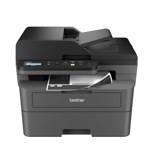
To make custom product labels, decide what the label must say, measure the surface it will cover, design the layout, print on suitable label stock and apply a test label before making a full batch. A short trial run catches most mistakes early. This guide takes you through each phase, adds a worked example, and covers the faults that appear most often.

Phase One: Plan the Content
List the details that must appear, such as product name, size or count, contact information and any required notices for your product type. Rules about wording differ by product and place, so check the current requirements that apply to what you sell.
Then add what helps the buyer: a short description, how to use or store the item, and a code for your own records. Draft the text in a plain document first and read it aloud. If a line is awkward to say, it is probably awkward to read on a small label.
In this guide
Phase Two: Measure and Size
- Wrap a strip of paper around the container or lay it on the box to find the available area.
- Record width and height, and leave a small margin from edges, seams and curves.
- Note whether the surface is flat, curved, textured or glossy, since this affects which label material will hold.
On a curved container, a label that wraps most of the way round needs a straight edge that follows the curve. Leave a small gap rather than letting the ends overlap unevenly, and keep text away from the bend.
Phase Three: Design the Layout
- Place the product name where the eye lands first, in the largest type.
- Use no more than two or three fonts and keep strong contrast between text and background.
- Keep important text away from the edges, since printers can shift slightly.
- Add a barcode or code only if you will scan it, and leave blank space around it.
Phase Four: Choose Materials and Print
| Choice | Think about |
|---|---|
| Paper or film facing | Film resists moisture better; paper is easier to write on |
| Adhesive | Match it to the surface and temperature the product sees |
| Printer type | Check which stock your printer supports |
| Finish | Matte reduces glare; gloss shows color strongly |
Print a single sheet or a few labels, let any ink dry, then apply one to a real product. Check that edges stay down and text is readable at normal distance.
Worked Walkthrough: Labels for a Jar
This is an invented example to show the order of work.
- Write the content list: product name, net amount, a short line on use, contact details and a batch code.
- Wrap a paper strip round the straight part of the jar and mark the height and circumference of the label area, then subtract a small margin from each side.
- Draw the label to size in your layout tool, with the name large at the top, details below, and the batch code in a corner.
- Print the layout on plain paper first and hold it against the jar. Check that nothing is cut off and that text is readable.
- Print one label on the real stock. Let the ink dry as the stock maker advises.
- Clean the jar, apply the label from the center outward, and press the edges firmly.
- Leave it for a day, then check the edges, rub the text lightly and see how it handles a damp cloth or refrigeration if that is part of normal use.
After the Trial
Look at the finished test label next to a real product. Is the text easy to read at arm length? Do the edges sit flat? Did the ink or heat mark stay put when rubbed lightly? If anything fails, change one thing at a time, such as the size, the stock or the adhesive, and test again. Keep the final template, stock details and printer settings in a short note so you can repeat the result next time without guesswork.
Common Scenarios
Products kept in a cold place
Adhesives vary in how they cope with cold or condensation. Check the stock maker’s information and try a label on a real container in real conditions.
Products that get handled often
Choose a durable facing and a finish that resists rubbing, and keep text away from the edges where fingers grip.
Small batches with changing text
Use a template with fields you can edit, and save a copy of each version so you know which text was on which batch.
Selling to the public
Check the rules for your product type and region, because required wording, units and notices vary. Ask the relevant authority or a qualified adviser if unsure.
Mistakes to Avoid
- Printing a whole batch before a trial. A single mistake in size or adhesive then wastes every label.
- Putting text near the edge. Printers shift slightly, and cut edges can clip letters.
- Applying to a dirty surface. Dust, oil and moisture stop adhesive from bonding.
- Using too many fonts. It makes the label hard to read and look untidy.
- Skipping a batch record. Without it you cannot tell which text went on which product.
Quick Troubleshooting
| Symptom | Likely cause | What to try |
|---|---|---|
| Edges lift | Dirty or curved surface, or the wrong adhesive | Clean the surface, use a smaller label or another adhesive |
| Ink smears | Not dry, or stock not suited to the printer | Wait longer, or check the stock type for your printer |
| Text cut off | Margins too small or printer shift | Widen the margins and check the print scale |
| Wrinkles on a curve | Label too large for the curve | Make it shorter in height or use a flexible film |
Key Terms
- Facing: the printable top layer of a label.
- Liner: the backing sheet the label peels from.
- Adhesive: the sticky layer that bonds the label to a surface.
- Bleed: artwork that runs past the cut edge to avoid a white border.
- Template: a saved layout that you reuse.
Keeping Labels Consistent Over Time
Label stock, adhesive and printer settings can change between orders, so record the stock name and settings on your template. Keep a sample label from each batch with its date. If a later batch looks different, compare it to the kept sample, then work out whether the stock, the settings or the surface changed.
Checking Legibility and Layout
Look at the printed label from normal handling distance, in the light where the product will be seen. Check that the smallest text can be read, that contrast holds on the real container and that nothing important falls on a seam or curve. Ask someone who has not seen the product to read it back to you, since fresh eyes quickly spot unclear wording.
Comparing Label Materials
The material you pick decides how a label looks, how long it lasts, and how it behaves when wet, cold, or handled. The table below gives a general comparison. Always check the product sheet from the supplier, since specific products vary.
| Material | Typical strengths | Typical limits | Common uses |
|---|---|---|---|
| Matte paper | Easy to print, takes handwriting, low cost | Stains with moisture or oil | Dry goods, shipping, storage bins |
| Gloss paper | Vivid color, smooth finish | Shows fingerprints, can smear if not designed for your printer | Gift items, shelf products |
| Kraft paper | Natural look, good for handmade branding | Absorbs moisture, colors look muted | Baked goods, candles, craft items |
| Vinyl or polypropylene film | Water and oil resistant, durable | Needs compatible ink or toner, costs more | Bottles, bath products, outdoor items |
| Clear film | Gives a printed-on-the-glass look | Shows the surface and bubbles beneath, so application must be careful | Glass jars, windows, premium products |
| Removable or repositionable stock | Peels off with little residue | Weaker hold, may lift on curved or cold surfaces | Temporary labels, reusable containers |
Printers matter as much as material. Inkjet printers need paper or film designed to absorb or dry their ink. Laser printers use heat, so the label stock must tolerate it without curling or melting. Using the wrong pairing is a common cause of smearing, jams, and peeling.
Adhesives and the Surface Beneath
A label can look perfect and still fail if the adhesive and surface do not match. Think about what the label will stick to and what it will face.
- Permanent adhesives bond firmly and are hard to remove. They suit products that should not be tampered with.
- Removable adhesives release cleanly, which is useful when containers are reused. They may not hold well in humid or cold conditions.
- Freezer-grade adhesives are designed for cold storage. Standard adhesives can lose grip in a refrigerator or freezer.
- Textured or powdery surfaces, such as raw wood, cloth, or dusty plastic, give adhesives less to grip. Sealing or wiping the surface may help.
- Low-energy plastics, including many polyethylene and polypropylene containers, can be hard to label. Look for adhesives made for these surfaces.
Preparing the surface
Clean the area with a lint-free cloth and a gentle cleaner. If you use alcohol to remove oils, let it evaporate fully before applying the label. Make sure the surface is dry and at room temperature. A cold, damp jar will collect condensation and prevent good adhesion.
Applying without bubbles
Peel back a small section of the backing, line up one edge, and press down from the center outward, smoothing as you go. A plastic card or a small squeegee helps. For curved containers, apply from the middle so that the edges can follow the curve. Wrinkles are easier to prevent than to fix.
Testing before a full run
Apply one sample label to a real container, then leave it for a day. Rub it, chill it, and wet it the way a customer might. If it holds, you can print the full batch with more confidence.
Curing time
Adhesives often reach full strength after several hours or a day. Avoid handling, washing, or chilling the item during this period unless the product instructions say otherwise.
Printing Methods and Cost Thinking
The best way to print depends on quantity, quality, and flexibility. Here is a general comparison, with no specific prices because they vary widely by region and supplier.
Home inkjet or laser printing
Good for very small runs, quick design changes, and testing. Per-label cost can be higher than bulk printing once you include ink or toner and sheets. Quality depends on your printer and settings, and water resistance depends on the stock and ink.
Thermal and desktop label printers
These print one label at a time on rolls and are efficient for shipping, barcodes, and repetitive text. Many use heat on special paper and need no ink, though the print may fade in heat or sunlight depending on the type. They are a good choice if you print many labels with similar layouts.
Online and local print shops
Professional printers offer full-color, weatherproof, and die-cut labels in custom shapes. Minimum order quantities and setup fees may apply, so compare quotes. Ask about proofs, because seeing a physical sample before a big order prevents expensive mistakes.
Watching for common print faults
Streaks usually mean clogged nozzles or a dirty roller, and a quick cleaning cycle often fixes them. Smearing points to ink that has not dried or to stock that does not match the printer. Misaligned text means the page size or label template is wrong, so check the settings and print one sheet on plain paper first. Faded print on thermal labels can result from heat, sunlight, or age.
Choosing between them
If you are still changing the design, print at home or with a small desktop printer. If the design is final and you need hundreds or thousands, a print shop may be more economical and consistent. Keep a record of the vendor, material, and size so reordering is simple.
Information You May Be Required to Include
For personal use or gifts, you have flexibility. For anything you sell, labeling rules may apply, and they differ by product type and location. The notes below are general, and not legal advice.
- Food, cosmetics, supplements, candles, and household chemicals can have specific rules about names, ingredients, net quantity, allergen statements, warnings, and the business name and address.
- Net weight or volume often needs a particular format and unit, sometimes in both customary and metric.
- Safety warnings, such as flammability or keep-out-of-reach-of-children statements, may be mandatory for certain products.
- Claims such as organic, natural, or handmade may be regulated, and wrong use can cause legal trouble.
- Barcodes for retail sale usually follow standards set by the retailer or a standards body.
Check with your local or national regulator, a small business association, or a qualified professional before selling. If a product falls into a regulated category, confirm the rules rather than copying another seller’s label.

A Worked Example With an Invented Soap Maker
Imagine a hobbyist who makes small batches of bar soap for a local market. This is a made-up scenario meant to show the decision flow, not a real business.
The soap sits in a cool bathroom shelf area and gets handled by customers, so she picks a matte paper band wrapped around the bar, with a sturdy adhesive strip on the back. Because the paper may touch moisture, she tests a sample under a damp finger and decides to switch to a water-resistant film for the front panel. She prints a test sheet at home, checks that the text is readable at an arm’s length, and lets the ink dry fully before cutting. She notes the material, size, and printer settings in a file so the next batch matches.
Before selling, she looks up the rules for her product category and region, adds the required name, ingredients, weight, and contact details, and asks a local small business office to review her wording. The result is a simple label that is legal, readable, and consistent, built from a few small decisions made in the right order.
Planning Batches and Reordering
Labels run out at inconvenient moments, and last-minute reprints are where small mistakes sneak in. A little planning smooths the process.
- Estimate how many units you will make in a quarter, and add a margin for spoilage and test labels.
- Keep a master file that records the final design, font, size, and print settings. Name each version clearly so you know which one is current.
- Store unused labels flat, in a cool, dry place away from direct sunlight, in a sleeve or box. Heat and humidity can curl them and weaken the adhesive.
- Keep a small reserve of backing sheets or spare labels for replacing damaged ones.
- Update batch codes, dates, or lot numbers by a reliable method, and double-check them before printing a whole sheet.
When something about your product changes, such as an ingredient or a size, update the label right away and remove old stock so the wrong version does not go out. A simple checklist at each print run, covering text, date, quantity, and material, catches most errors before they reach customers.
Ready to Buy? Start Here
If this guide helped you decide what to look for, these products are a place to start.

As an Amazon Associate we earn from qualifying purchases. Prices and availability are shown on Amazon.
FAQ
Do I need design software?
No. A word processor or a free label tool can do simple layouts. Use dedicated software if you need many versions or linked data.
Why do my labels peel at the edges?
Dust, oil or a curved surface are common causes. Clean the surface and consider a different adhesive or a smaller label.
What size should the text be?
Large enough to read comfortably at arm length. Print a draft on paper and hold it up to judge before using real stock.
Can I print labels at home?
Many people do, provided the stock suits their printer. Check the printer maker’s list of supported media and settings.
How do I keep labels consistent between batches?
Save the template, stock details and printer settings, and compare each new batch to a kept sample.
Are home-printed labels waterproof?
Not by default. Standard paper labels can run or peel when wet. For water resistance, use waterproof label stock designed for your printer type, such as polypropylene or vinyl, and consider a clear laminate or sealant approved for the material. Test a sample by soaking it before using the labels on products.
How do I put a label on a curved bottle without wrinkles?
Start in the center and press outward, smoothing toward the edges. Use a label size that does not wrap too far around the curve. Smaller, wider labels follow curves better than tall ones. A soft squeegee or card helps remove trapped air as you go.
Can I laminate a label to protect it?
Often yes, if the laminate suits the label stock and printer ink. Clear laminating film or a clear overlay label can add scratch and moisture resistance. Test a sample first, since some inks smear under certain coatings, and follow the manufacturer’s instructions.
What is a die-cut label?
A die-cut label is cut to a custom shape, like a circle, oval, or outline, instead of a standard rectangle. Printers make them with a shaped blade. They look polished but may require larger orders, setup fees, and a finished design, so confirm details with the vendor first.
Do I need a barcode on my product labels?
Only if you sell through retail channels or marketplaces that require one. Many small sellers do not need a barcode for direct sales. If a retailer asks for one, follow their guidelines, and obtain codes from the proper standards organization instead of unofficial sources.
A Step-by-Step Process for Making Custom Product Labels
A good custom label looks effortless, but it is the product of a short chain of decisions made in the right order. Content before decoration, measurements before design, a printed proof before a full run: follow that order and most label disasters never happen. The steps below walk the whole chain at a practical, concept level, so you can adapt them whether you print at home, use an online printer, or work with a local print shop.
Step one: gather the content the label must carry
Start with words, not artwork. List what the label has to say: the product name, your brand name, the variant or scent or size, the net quantity, and any information your kind of product is expected or required to carry, such as ingredients, directions, warnings or care notes. Check the expectations for your product category and your market before designing anything, because discovering a missing required line after printing is an expensive lesson. Write the exact final wording now, proofread it as text, and have another person read it too; spelling errors are far easier to catch in a plain document than on a finished label.
Step two: measure the container and define the label area
Measure the flat, smooth area of your container where the label will sit, avoiding curves, seams, ridges and the shoulder of a bottle or jar. Note the height and width available, and how much of the container the label should wrap. If you sell several sizes, measure each one separately rather than scaling by eye, because proportions change. Decide at this stage whether you need a single label or a front-and-back pair, since that choice shapes the layout: a pair lets the front stay clean and visual while the back carries the detailed text in a readable size.
Step three: lay out the design with a clear hierarchy
Arrange the content so the eye lands in the right order: brand, product name, variant, then supporting details. Give the product name the most visual weight after the brand, keep body text large enough to read at arm’s length in ordinary light, and leave breathing room around the edges so nothing important sits in the zone where the label curves away or where a printer’s trim can wander. Align elements on a simple grid, limit yourself to a small number of typefaces and colors, and make the variant difference obvious at a glance, since customers and packers alike distinguish variants before they read fine print. Design in the actual size; a layout that looks balanced on a big screen can turn cramped or sparse when printed at label scale.
Step four: print a proof and live with it briefly
Print a single label, or one sheet, and apply it to the real container. This proof stage is where you check the things screens cannot tell you: whether the size truly fits, whether text stays legible on the curve, whether colors look right against the product and the container, and whether the label sits straight without fighting the surface. Put the proofed product on a shelf among other products, look at it in daylight and in warm indoor light, and hand it to someone else and watch what they read first. Live with it for a day if you can; small annoyances, like a variant name that hides in shadow, announce themselves with a little time.
Step five: run an adhesion and handling check
Before committing to a full print run, test how the label behaves in the life your product actually leads. Rub the edges, handle the container with damp hands if that is realistic, chill it if the product is refrigerated, and let it sit where it will be stored. Check that corners stay down, printing does not smear, and the label does not wrinkle as the container is handled. If you plan to apply labels by hand in batches, time yourself on a small batch too: a design that is fiddly to align will slow every packing session and drift in placement from label to label.
Step six: print the run and apply with a simple jig habit
When the proof passes, print the run and apply labels with a consistent technique: clean, dry containers; the same starting edge; firm pressure from the center outward; and a quick visual check of each finished item against the proof. Keep a small stock of spare labels for the inevitable misalignments, and store printed labels flat, dry and out of strong light so the last sheet behaves like the first. Record the final design file, the printer settings that worked and the label stock you used, so a reprint months later matches the batch your customers already know.
Layout Decisions That Make Labels Work Harder
Contrast is the quiet workhorse of label design. Dark text on a pale ground, or the reverse, stays readable in the mixed lighting of real shelves and market stalls, while mid-tone text on a mid-tone background fails everywhere except the design screen. If your brand colors are soft, put the words that matter inside a solid panel of a stronger tone rather than shrinking from contrast altogether. White space is not wasted space: it is what separates the product name from the details and lets each do its job, and crowded labels read as cheap even when the product is not.
Think about the label as one face of a small system. The front sells and identifies; the back informs; a neck tag, seal or lid label can carry the variant or a short message without crowding either main face. Consistency across a product range matters more than brilliance on any single item: same layout skeleton, same positions, with color or a clear band changing per variant. A customer who knows your range can then find their variant by pattern, and your shelf presence reads as one family instead of a crowd of strangers.
Choosing Label Materials at a Concept Level
Paper labels are economical, print beautifully and suit dry products in dry environments. Their weakness is water: a paper label on a product that will be chilled, splashed or handled with wet hands can soften, wrinkle or lift. Film or synthetic labels resist moisture and handling far better and suit bathroom, kitchen and refrigerated products, at a higher cost per label. Within either family, the adhesive matters as much as the face: a standard adhesive suits smooth glass, plastic and metal, while textured, flexible or cold-applied surfaces may need a stronger grip, and products you want to reposition or remove cleanly need the opposite. Match the material to the worst conditions the product will meet, not the kindest, and test on the real container rather than trusting descriptions.
Finish changes both look and behavior. A matte finish hides minor scuffs and fingerprints and photographs softly; a gloss finish deepens colors and wipes clean easily. If you hand-write dates or batch marks on the label, test your pen on the chosen finish, because some coatings reject ordinary pens entirely. For very small batches, printable sheets at home keep things flexible; as volumes grow, professionally printed rolls or sheets bring consistency and save application time. Either route is fine; what matters is that the proof and adhesion checks happen on the exact stock you will use in production.
Troubleshooting Custom Label Problems
Labels peeling, bubbling or wrinkling after application
Peeling usually means the surface was not clean and dry, the adhesive is wrong for that container material, or the label is being asked to bend around too tight a curve. Bubbles come from applying one edge fully before the rest, trapping air; apply from the center outward with steady pressure. Wrinkles on curved containers often mean the label is too tall for the straight section of the wall; shorten it to the flat zone or split the design into front and back labels that each sit flat.
Colors on the printed label do not match the screen
Screens glow and paper reflects, so some shift is normal, but a large gap usually means the design used colors that print dully, or the printer and stock combination is muting them. The proof is your correction tool: adjust the design based on the printed proof, not the screen, increase contrast where text meets background, and re-proof. Keep the accepted proof with your records as the reference standard for every future reprint.
Text that is technically correct but hard to read
If readers squint, the hierarchy is failing: body text too small, letter spacing too tight, or low contrast against a busy background image. Move detailed text off any photograph or pattern onto a calm panel, increase the size of the lines customers actually need, and shorten sentences. A label is read in seconds, often at arm’s length, by someone deciding whether to pick the product up; design for that moment rather than for a careful desk reading.
Common Mistakes When Making Your Own Labels
The most common mistake is designing before measuring, producing beautiful artwork in the wrong size that must be stretched, cropped or shrunk into illegibility. The second is treating the first print as the final print and skipping the proof, which is how spelling errors, crooked alignment and peeling corners reach customers. The third is cramming: every fact, claim and decoration competing on one small face until none of them land. Edit the label like you would edit a sentence; if a line does not help the customer identify, choose or use the product, it belongs on the back, on an insert, or nowhere.
Two quieter mistakes deserve mention. One is letting variants differ only in small print, which causes packing errors and customer confusion; make variant identity visible from a distance. The other is forgetting the unglamorous details: quantity, directions and required information squeezed in as an afterthought, sometimes in text too small to serve their purpose. Gather content first, as step one insists, and the layout will have room for what matters because it was planned around it.
Final Quality Check Before a Label Goes Live
Hold a finished, labeled product and run this check. The brand and product name read clearly at arm’s length. The variant is obvious. Required and practical information is present, correct and legible. The label sits straight, flat and fully adhered, with no lifted corners, bubbles or wrinkles. It has survived your handling and environment test. The design file, proof and material notes are saved for an identical reprint. If every point holds, the label is ready to represent the product; if any point fails, it is far cheaper to fix now than after a shelf, a market stall or a delivery run has done the testing for you.
More Questions About Making Custom Product Labels
How many label designs should a small range have?
One design system, varied per product and variant. A shared skeleton with consistent positions for brand, name and details makes the range look professional and speeds up both design and packing. Reserve genuinely different designs for genuinely different product lines, and even then keep the brand elements in the same places so the family connection survives.
Can I change my label design later without confusing customers?
Yes, if you change it gradually and keep the anchors: brand presentation, product name position and variant signals. Refresh colors or illustrations first, keep the layout, and avoid changing everything in one step. If old and new stock will sit side by side for a while, that consistency is what reassures a returning customer that it is the same product they liked.
What is the simplest way to keep labels consistent across batches?
Save the approved proof, the design file and a note of the exact label stock and printer settings, and compare the first sheet of every new batch against that proof before applying any of it. Most inconsistency creeps in through silent changes: a different stock, a resized file, a substituted color. A thirty-second comparison at the start of each batch catches all of them.
Should handmade products look handmade on the label?
They can, as long as handmade character does not cost readability or required information. A warm typeface, a hand-drawn mark or a kraft-style stock can signal the making honestly while the layout stays disciplined: clear hierarchy, honest contrast, legible details. Charm and clarity are not opposites; the labels that achieve both are the ones customers remember and trust.
Testing Labels the Way Customers Will Meet Them
Before a design is final, test it under the conditions your customers actually meet it in, not the conditions of your desk. Put the labeled product where it will be sold or stored: on a shelf among competitors if it will sit on one, in a fridge if it will live in one, in a bathroom cabinet’s humidity, in a market stall’s changing daylight. Look at it from the distance a shopper first sees it, then at arm’s length, then in the hand. At each distance a different layer of the label does the work: the silhouette and color first, the product name next, the details last. If any layer fails at its distance, adjust that layer specifically rather than redesigning everything; most label problems are one layer deep.
Hand the product to people who have never seen it and ask them to tell you what it is, what variant it is and how they would use it, using only the label. Their hesitations are a map of your label’s weak points, and they will find different ones from you because you cannot un-know your own product. Test with the actual buyers in mind too: reading glasses are common, market light is unkind, and a label that only works for young eyes in bright light will quietly undersell a good product for years. A short round of honest testing at this stage costs an afternoon and improves every unit you ever sell.
Planning label quantities and reprints
Print in quantities that match how fast the design might change. Early in a product’s life, when wording, sizing or branding may still evolve, smaller runs protect you from a cupboard of obsolete labels and let you fold in what you learn from the first customers. As the design settles, larger runs bring the cost per label down and keep consistency across a longer period. Either way, keep the approved proof and one physical sample from each batch in a file; if a later batch drifts in color or trim, that sample is your evidence and your reference for putting it right.
Build the reprint trigger into your routine, just as you would for packing supplies: when the label stock falls to the point where one busy period could empty it, order the reprint then, using the saved file and settings rather than reconstructing them. Note the label stock and finish on the order itself, because a silent substitution by a supplier, a slightly different white, a glossier finish, can make a whole batch look subtly wrong beside the previous one. Consistency is a quality signal customers read without knowing they are reading it, and labels are where that signal is printed.
Labeling for Different Sales Channels
Where a product is sold changes what its label must do. Sold in person, at a market or from your own shelf, the label can lean on you being nearby to answer questions, though it should still stand on its own for the many moments you are busy with another customer. Sold online and shipped, the label becomes part of the unboxing: it must survive the parcel journey without scuffing, confirm to the buyer at a glance that the right variant arrived, and carry anything they need before they find your listing again. Sold through a retailer, the label must meet that retailer’s own requirements as well as the general ones for your product type, which is another reason to gather content requirements before designing, not after.
If you sell through several channels, resist designing separate labels for each unless a channel genuinely requires it. One strong label that works everywhere keeps production simple, stock flexible and the brand consistent, and a product can move between channels without a relabeling session. Where a channel needs something extra, add it as a supplementary sticker or tag rather than a competing design, placed so it does not cover anything the main label says. The main label remains the product’s identity; channel additions are just postage stamps on the same envelope.
Handwritten and small-batch touches that still look professional
Very small producers often finish labels by hand: a batch number, a date, a variant ticked or written in. Done deliberately, this adds honesty and charm; done carelessly, it undermines an otherwise polished label. Keep handwriting to one or two small fields in a reserved space designed for it, use the same pen type that you tested on the finish, and write at a table rather than on a knee between other jobs. If your handwriting varies with tiredness, a small stamp for the repeated element gives a steadier result while keeping the handmade character. The rule is the same as everywhere else in this guide: the personal touch should sit inside a disciplined layout, where it reads as intention rather than improvisation.
Numbering batches by hand has a practical benefit beyond charm: it ties each unit to the day and the making, which helps you answer questions, trace a problem to one batch instead of a whole product line, and learn which batch customers responded to. Record what each batch code means in the same place you keep the approved proof, so the code on a label a year from now can still be decoded by you or by anyone who takes over the making.
Treat every label run as a small promise kept: the product inside matches the words outside, in the variant named, in the quantity stated, looking the way the design said it would. Sellers who keep that promise consistently find that the label stops being packaging and becomes reputation, carried on shelves and in cupboards long after the purchase itself. That is worth the measuring, the proofing and the testing this guide describes, every single batch.
The Short Version
Plan the content, measure the surface, keep the layout simple and test one label on a real product. Adjust material and adhesive if edges lift. Save your template and settings so each batch matches the last.